

TECH FOR KOREA
Tech for Korea (http://www.techforkorea.com) is an online media portal providing the latest news from the Korean venture and startup community. As a lead UX designer, I lead new user interface designs through the full design and development cycle. I was collaborating with designers, developers and business stakeholders to design and develop Tech for Korea's first mobile application that would re-define the way people read technology news on mobile devices.


Main

Menu

Search
Main
Before

Main

Menu

Search
Main
After
Business Stakeholder Interview
Me:
Hi, Jason. Thanks for taking the time to speak with me regarding the mobile app design for TFK. What inspired you to say Yes to this initiative?

Jason L. Thom:
As you know, our web traffic is growing very quickly but in order to diversify our channel and also meet demands of our future users, I thought it's necessary to develop an user-centric mobile app/platform too.
Yes, totally. Mobile will increasingly become the most popular platform choice for every day users, for shopping, gaming and of course, reading News!
What core or innovative features or use cases would you like to build in our mobile app?
Me:
I can think of two critical features that will be very useful for our users. One is bookmark and library feature, allowing app visitors save articles to be read later. The other is Breaking News alert feature -- the idea is to notify users of any new, surprising news on their home screen, such that we're constantly engaging users, thus increasing our user retention rate.
Jason L. Thom:
Make sense. Besides, any thoughts on introducing a navigation design that categorizes the news by emerging IT topics (e.g., Cloud, IoT, Blockchain) ?
Me:
I remember you mentioned this idea to me before. Yes, given I see about a third of our first-time visitors finding our website through google search related to IT terms and startups in Korea, It'd make sense to organize our contents that way. Let's discuss this further! -Abridged-
Jason L. Thom:
CEO / Editorial Writer
CEO / Editorial Writer
CEO / Editorial Writer
So What's Next?
After interviewing our team leader, I began to build the prototypes based on the feedback from the team and analysis of our current website design. Through competitive analysis, modern mobile app design framework and best practice research, I was able to develop a number of UX artifacts in support of product development. This includes: feature lists, user flows, wireframes, high-fidelity prototypes, etc.
Today, Tech for Korea does not have a mobile app platform. Our current website in mobile view does not reflect mobile-friendly design. It is satisfying the minimum requirements for our viewers.


New York Times is one of the most popular news apps in mobile app store today. The app has been specifically designed for browsing and navigating articles, blogs, videos and slide shows on the iPhone platform. Its appealing and well-organized layout influenced the design of our mobile application.

Apple News

TechCrunch

The New York Times
TechCrunch is another well-developed news app that influenced design structure of Tech for Korea. Our prototype was inspired by their simple yet layout and book mark system.
Apple News is comprised of many news articles curated from other News resources. Its curation layout inspired our main page design
Tech for Korea's Current View on Mobile Browser
General Benchmark / Competitive Analysis
Site Analysis
Current Pain Points
-
Cannot adjust text size; Users are also not capable of zooming in/out the screen
-
Each news's thumbnail and pre-view block is unnecessarily taking too large portion of a phone screen
-
It is not capable of saving articles, so users cannot bookmark them to read later
-
There's no alert system to notify users of new or breaking news
-
To access older articles, readers need to click "Read More" button locating at the bottom of each article (the image and the words are not clickable)
Solutions
-
The size of text is adjustable in settings
-
Reduce article pre-view size, so users do not have to scroll all the way down to find the article that he/she wants to read
-
Users are able to save articles for their next visit by using bookmark manager
-
Add alert system in the mobile app so that users do not have to go into the app to check if the latest news is uploaded
-
Users can click any parts of the screen for an older article to view the full page.
Prototype
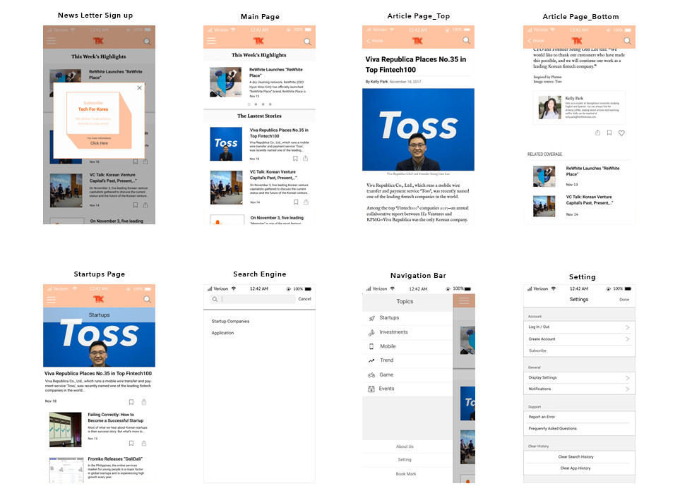
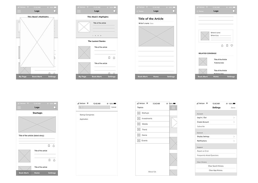
Prototype has been created based on the outcome of UX research and detailed gap analysis of the company's present mobile-view version of the website.



User Testing
During the test, four key tasks were given to our participants
Subscribe to Tech for Korea's Newsletter
Locate the latest news and bookmark the article
Find 1-2 articles about a Blockchain startup
Change the text size
Surprisingly, in a short matter of time, all of the participants completed the tasks with no major issues. However, the result indicated that 67% of them felt that the navigation bar located at the bottom of screen was distracting to them when they were playing around the page. In addition, few testers told me that the original color, bright orange, did not project a professional vibe to the website. Besides, I received 3-4 other feedback on design and interaction that helped me iterate the prototype quickly and efficiently.
Next Steps
Most of the initial user experience design requirements that were gathered and iterated with my design members and CEO were translated into various UX design documentation. However, throughout the research project, I faced difficulties with collecting enough feedback from our current user base because we currently do not have in-house capabilities to survey readers directly or establish a help center where users can leave comments on our website. We'll work to establish a feedback loop as we start to develop the mobile app in parallel. Our highest priority in next 4 months would be to develop and provide superior, consistent user experiences of Tech for Korea across both desktop and mobile platform.
Our UX design team is focused on improving the layout and design of our current website. The mobile app development work will kick off once the revamp of our web design is complete.